

Overview
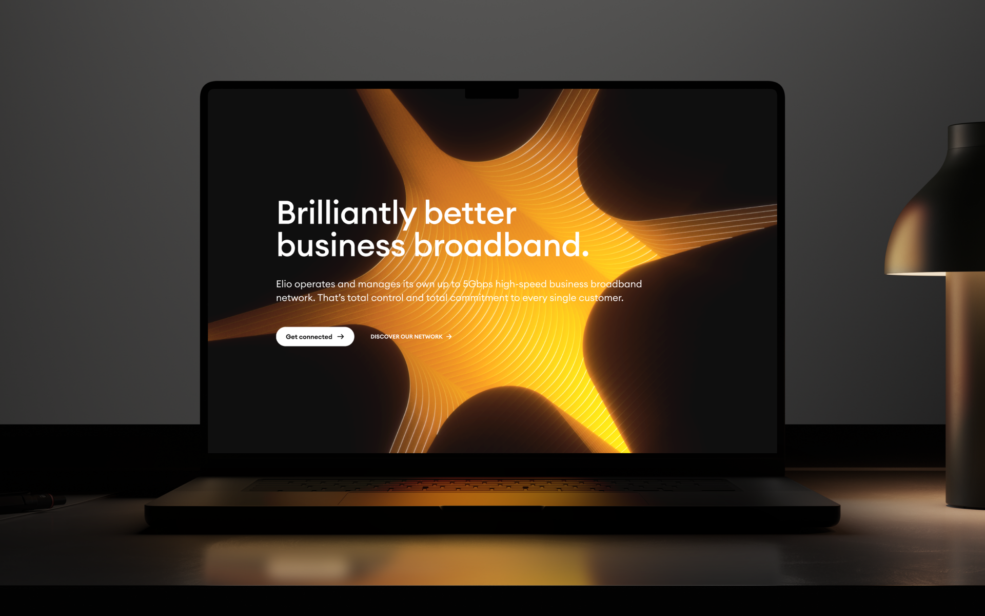
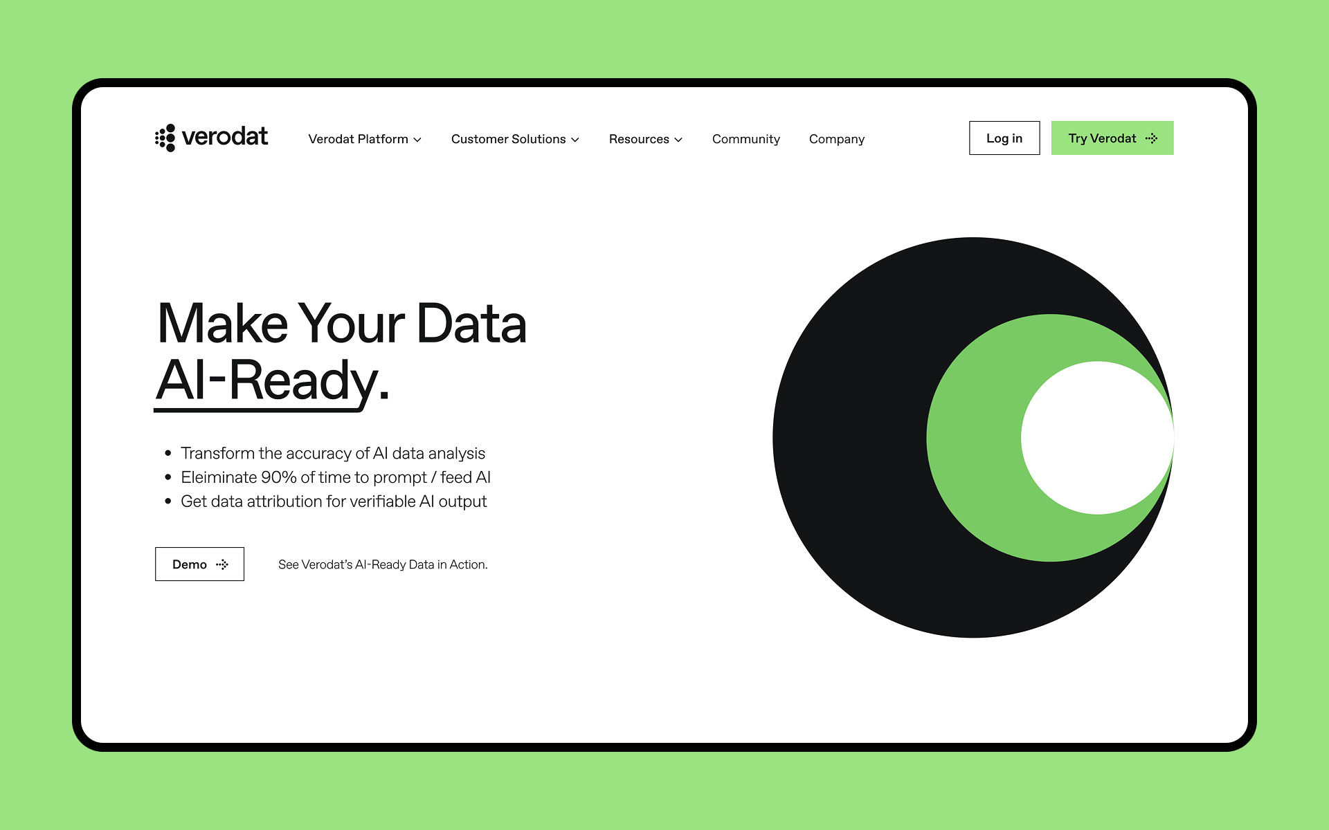
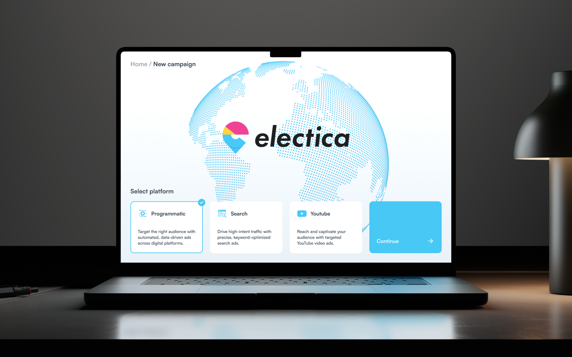
Responsive web design ensures your website performs beautifully on any screen—mobile, tablet, or desktop. We design and develop flexible layouts, scalable components, and device-friendly experiences that adjust to real-world usage. Whether launching a new site or improving an existing one, our responsive approach ensures your content is clear, accessible, and consistent across every platform.
Why work with us
We don’t just make sites look good—we make them work everywhere. Our team combines UX best practices with modern front-end development to create fully responsive experiences that feel natural and perform smoothly. From mobile-first design to cross-browser QA, we handle every detail to make sure your users stay engaged—wherever they are.
It was an absolute pleasure dealing with Tribe Digital. I can see plainly how and why Tribe Digital are regarded and awarded as they are. Consummate professionals, talented, passionate and ambitious… it’s a Michelin grade recipe.
Eoghan Coleman
UN / International Organization for Migration
FAQ
Users expect fast, smooth digital experiences—no matter what device they’re on. Below are common questions from marketing, product, and IT teams looking to upgrade their web presence through responsive web design.
What is responsive web design?
A design and development approach where your website adapts automatically to different screen sizes and devices.
Why is responsive design important?
It improves user experience, accessibility, SEO rankings, and engagement across mobile and desktop users.
What devices do you test on?
We test across modern iOS and Android smartphones, tablets, laptops, and desktop resolutions.
Do you support all browsers?
We test for compatibility with Chrome, Safari, Edge, and Firefox—focusing on current and recent browser versions.